In my last blog post, I detailed 5 ways to more effectively use PowerPoint (the principles apply to Keynote and ![]() other presentation software). But those 5 tips just scratched the surface. I know there are many of you out there who use PowerPoint to teach the Bible to your Bible study group, so I thought I’d share a few more pointers from the book Slide:ology – The Art and Science of Creating Great Presentations.
other presentation software). But those 5 tips just scratched the surface. I know there are many of you out there who use PowerPoint to teach the Bible to your Bible study group, so I thought I’d share a few more pointers from the book Slide:ology – The Art and Science of Creating Great Presentations.
Tip 1: Avoid 2-line titles. The presentation software will allow for 2-line titles, but avoid the temptation to drag out what you want to say. Be concise and place your titles on just one line.
Tip 2: Build your text sequentially – don’t reveal it all at once. If your slide has 5 lines of text, reveal one line at a time (hopefully without any animation!). Don’t reveal all 5 lines of text at once. You want to keep the audience on the point you are making, and not let their eyes jump ahead of you to the next point.
Tip 3: Gray out your text. Once you make a point and move to the next one, gray out the previous point. This keeps the audience’s eyes moving to the next point in your presentation.

Tip 4: Use realistic photos of objects. Favor using images of real objects over staged or metaphorical ones.
Tip 5: Pay attention to the placement of images and text. When using an image on a slide, make sure that the person or object in the image faces the text and does not face away from it.
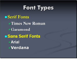
Tip 6: Use a Serif font. Serif fonts have the little “feet” that guide the letters into each other and therefore make them easier to read. Save Sans Serif fonts (Sans means “without” – without those little “feet”) for titles, subtitles, or captions.
Tip 7: Place logos in the bottom right corner of the slide. If you create a PowerPoint slide deck and want to incorporate your church’s logo, place it in the bottom right corner. Text can be placed rag right and flowed around it.
Tip 8: Use negative space. Negative space refers to the white space on the slide. Clutter is a failure of design. It’s ok to have clear space on your slides!
Tip 9: Simplify charts. Less is more. Keep data simple. Remember, the goal is to communicate with your audience, and the data you share needs to be simple enough that it communicates insights and conclusions.

Tip 10: Use the 3 second rule. Think of slides like “little billboards.” A driver has about 3 seconds to process the message on a billboard. Use that same rule of thumb when creating slides. Can the message on the slide be processed in about 3 seconds? If the answer is no, then simplify until it can.
