If you are like me, I like to use PowerPoint as a teaching tool from time to time. Years ago I discovered the book slideology, which has been coined “the Bible for PowerPoint.” I’ve learned a lot about how to improve PowerPoint slides and create more engaging presentations. Here are 10 quick tips for making a powerful point with PowerPoint.
1. Follow the “6 X 6 X 6” Rule. As you create slides, do not use more than 6 words in the slide title, no more than 6 lines per slide, and no more than 6 words per line. This will keep the words to a minimum, and your impact to a maximum. It also forces you to be precise – think “every word matters” and “words create worlds.” Have a laser-like precision when you put words on slides.
2. Be consistent in the types of fonts you use. You’ve seen really bad PowerPoint slide shows in which the presenter used all kinds of images, right? Some of the images were of real-world objects, other images were cartoons, and they should not be used together. If you start with one kind of image, stick with that throughout your PowerPoint slide deck. Be consistent, not schizophrenic.
3. Don’t overuse animation. Yes, it’s fun when you first discover all the different ways words can be programmed to appear, crawl, spin, bounce, and twirl onto the screen. But too much of a good thing isn’t a good thing. Keep your animations simple and use them minimally.
4. Make sure everyone can comfortably read each slide. No squinting allowed! As you create your PowerPoint slide deck, ask yourself whether the person who sits furthest away from the images can read the words. This goes back to the 6 X 6 x 6 Rule – “more is less.” We’ve all been forced to read someone’s bad slide that has nothing but words from top to bottom at about a 14-point font – and it’s miserable. Use the largest font possible and as few words as possible.
5. Don’t let PowerPoint become a crutch. Change things up. Move things around. Go low-tech from time to time. Keep your audience guessing how you will communicate with them when you’re together. If you use PowerPoint each time you lead a presentation or a group Bible study, you reduce your impact because you are being too predictable.
6. Use fewer slides, but use what you must. The right amount of slides per presentation is as many slides as are necessary. Some presenters require as many as four slides per minute while others will linger on any given slide for up to four minutes. The point is to use as many slides as necessary to get your point across. I have found that fewer slides that follow the 6 X 6 Rule work best to create pleasing presentations. And please, stick to one point per slide.
7. Declutter your slides. Clutter is a failure of design. Whitespace refers to the areas of the slide left unused. It could be the empty areas that separate elements from one another, or the drama created when an element is set in vast amounts of space. Inexperienced presenters think whitespace is expendable – especially when they need to incorporate unwieldy amounts of contents that’s “too important” to be distilled or simplified despite its cumbersome density. After all, whitespace…carries no information, so what’s the harm in filling it up? The harm is that the audience find these slides difficult to comprehend. Whitespace is as much an element of a slide as titles, bullets, and diagrams. In large part, the use or misuse of whitespace determines a slide’s effectiveness. –Slide:ology, p.106.
8. Don’t use more than 2 kinds of fonts in your presentation. It’s OK to use only one kind of font in your presentation, but limit your choices to a maximum of 2! If you use more than 2 fonts, your presentation will begin to distract your audience. Don’t use 5 or 6 kinds of fonts and unintentionally create a “Frankenstein-ish” slide deck. This is a case of “less is more.”

9. Know when to use Serif and Sans Serif fonts. Serif fonts have “little feet” that guide the letters to each other. Serifs usually work best when there is a long sequence of words that go beyond one line. Serif fonts are typically easier for the eye to process quickly, and they are a good choice when you have a lot to say. A Sans Serif (sans = “without”) font doesn’t have the little feet and are simple and elegant. Sans Serif is a good font for titles on slides, while a Serif font is good for the primary text on the slide.
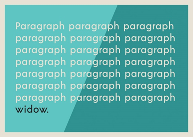
10. Watch out for widows. In typesetting terms, this is a single word, or even a couple of words, that appear at the end of a paragraph of text. A widow is the only word or phrase on the last line. To avoid this, reduce the number of words, use a hard return, or change the size of the text block. Widows create an asymmetrical look and should be avoided.
To learn more about how to create outstanding PowerPoint presentations, purchase a copy of “the Bible” for presentations, slide:ology.

[…] to use PowerPoint as a teaching tool from time to time. Years ago I discovered the book slideology, which has been coined “the Bible for PowerPoint.” I’ve learned a lot about how to improve […]